Computer programmers and computer scientists always apply kinds of visuals like graphs and diagrams to help them better illustrate their perspective, like to express the relationship among server, client, and model. However, improper use of visuals may distract the audience. In this sense, it is important to follow or adapt specific strategies, and among all the strategies, people need to let the visuals contribute to their writings. Indeed, as Irish (2015) stated, “we must have a clear purpose as we select a visual representation. The photo, or chart, or table provides justifying information to support the claims in a document” (p. 58). With this purpose, people are supposed to let the visuals they used become meaningful. Furthermore, there are other strategies like that people need to pay attention to visuals on the aspects of colors, layers, and so on so that the visuals should be engaging. In this writing, the writer will list the five most important strategies from Irish’s Writing in engineering: A brief guide and Frankel and DePace’s Visual strategies: A practical guide to graphics for scientists & engineers, and the writer will analyze the strengths and weaknesses of several visuals.
The Five Most Important Strategies
- Most of all, the use of the visual is to connect it to the text, which means that the visuals serve by “supporting the claims in a document” (Irish, Page 58).
- Different visuals function differently. Tables are to “make data visual and meaningful”(Irish, Page 63). Graphs and charts aim to “visualize patterns and trends”(Irish, Page 68). Diagrams are for “showing specifics” (Irish, Page 76).
- People need to pay attention to the caption: “make captions stand alone. Many readers look at the pictures and tables first, so the caption frames their understanding” (Irish, Page 82).
- In the color area, Frankel & DePace claim that “people could choose colors to draw attention, to label, to show relationships (compare and contrast), or to indicate a visual scale of measure” (p. 20).
- People could show different layers in a visual. People could “add layers to overlap multiple variables to create a direct relationship in physical space” (Frankel & DePace p.22).
Analysis of Examples
Figure 1
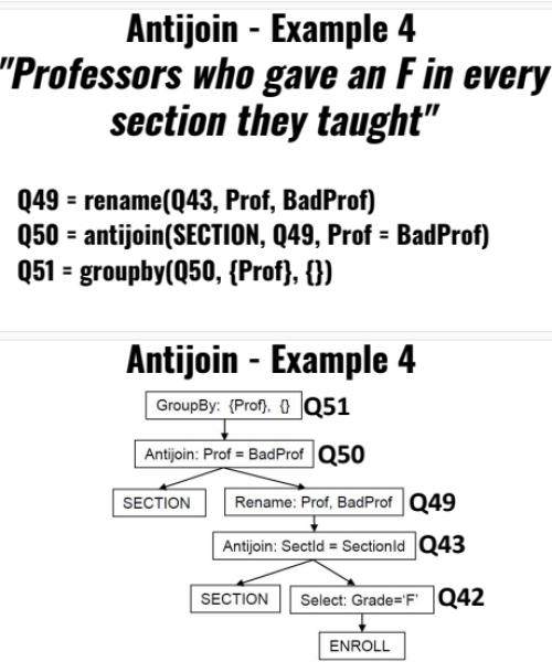
The Screenshot of Using Antijoin for Example 4

Note. This screenshot is taken from 3200 Database Design of Professor Jose Annunziato.
As shown in Figure 1, Professor Jose Annunziato shows a graph representing the logical order of using the antijoin for a question. The first advantage of this graph is that it could help the professor illustrate how to solve the question in a more precise and visualized way rather than just listing the code as shown in the top part of the screenshot, which means the graph is meaningful. The arrow represents the direction and helps the audience to understand the order. The bolded characters represent the references above. One way to improve the graph is to color the keywords, like “GroupBy,” “Antijoin,” red, as Frankel & DePace suggest so that the audience could pay more attention to the keywords.
Figure 2
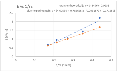
The Plot of Voltage VS 1/Distance for Lab 16

Note. This plot is from lab 16, Electric Field and Electric Potential, of 1148.
The second example is a plot of my past course. This plot is helpful to support my analysis of the data collected in the investigation, which follows the most significant rule Irish states. I utilized two colors to highlight and contrast the difference between the theoretical and experimental results, as Frankel & DePace suggest. In addition to the color, I used the data points on purpose. As Irish claims, “by highlighting the data points, … so a viewer is less likely to assume the consistent slope” (p. 71). In other words, with data points, the audiences will be more explicit about the specific data situation rather than a general trend. However, there is room to improve the aesthetics. It would be better if the two sentences align to the left and place the figure title in the middle, making the whole figure more consistant.
There are more visual strategies other than those mentioned above. However, the most vital role of visuals is to let the visuals support people’s ideas rather than distract the audience.
References
Frankel, F. & DePace, A. H. (2012). Visual strategies: A practical guide to graphics for scientists & engineers. New Haven: Yale. Retrieved from: https://onesearch.library.northeastern.edu/permalink/f/365rt0/NEU_ALMA51260280660001401
Irish – Chapter 3 – Strategies for Visuals (2015).pdf. From Writing in engineering: A brief guide. Eds. Deans, T. & Poe, M. New York: Oxford
